
Hue defines the primary color family such as red, blue, yellow, purple etc.
Understanding color harmony and knowing how to mix hues can unlock a whole new level of creativity. Finding colors that go well together is essential to achieving the desired look.
In this article, we'll delve into the secrets of color harmony and provide you with practical tips on mixing hues to create stunning combinations. Get ready to discover your own unique style and add a splash of visual appeal to your surroundings.
Building a solid foundation in colour psychology and theory is essential to unlock the secrets of colour harmony. In this section, we will delve into the psychology behind different colours and explore how they affect our emotions and perceptions. Understanding the impact of colours on our mood and behavior can help us make informed decisions when combining them.
Moreover, we will explore the fundamental principles of colour theory. This theory provides a framework for understanding how colours relate to each other and how they can be combined to create aesthetically pleasing compositions. Key concepts such as complementary, analogous, and triadic colour schemes will be discussed, offering valuable insights into harmonious colour combinations.
Colours have a profound impact on our emotions and can evoke specific feelings or associations. By understanding the psychological effects of different colours, we can harness their power to create desired atmospheres. Here are a few examples:
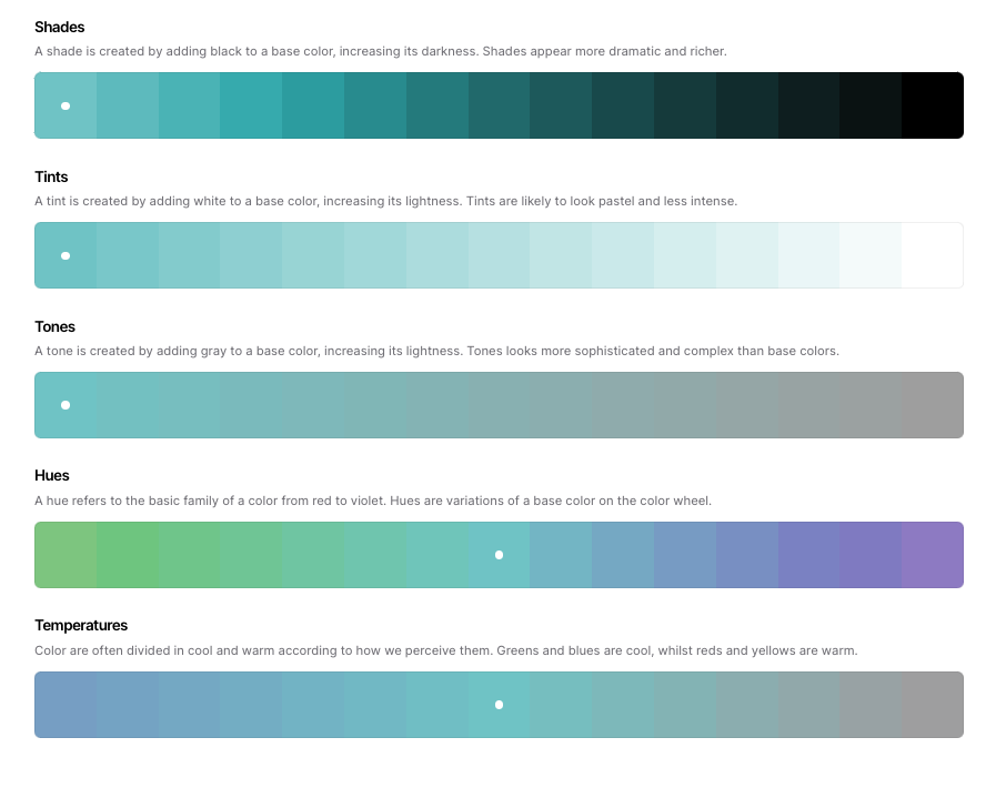
Colour theory provides a systematic approach to combining colours harmoniously. By understanding these principles, we can create visually appealing compositions. Here are the key concepts:
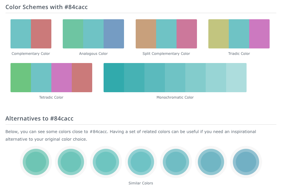
Starting with the brand colour for this website #84cacc, I used the Coolors colour tool to show:
By understanding the psychology of colours and the principles of colour theory, you can make informed decisions when selecting and combining colours in various contexts, be it in interior design, fashion, or visual art. Let's now explore different colour combinations to see these concepts in action.
Now that you have a basic understanding of colour psychology and theory, it's time to unleash your creativity and put that knowledge into practice. In this section, I'll guide you through various colour combinations, showcasing examples of successful pairings and offering insights on how to create your own unique combinations.
A monochromatic colour scheme involves using different shades, tints, and tones of a single colour. It creates a harmonious and elegant look that is easy to pull off. Experiment with different intensities of your chosen colour to add depth and visual interest to your designs.
Harmonious colour combinations involve selecting colours that are adjacent to each other on the colour wheel. These combinations create a sense of cohesion and balance. Look for colours that share a similar undertone or have a subtle contrast to create a harmonious palette that speaks to your personal style.
If you're feeling adventurous, try out bold and contrasting colour combinations. This involves pairing colours that are opposite each other on the colour wheel, such as blue and orange or red and green. These combinations create a striking visual impact and can add excitement and energy to your designs.
Remember, when mixing colours, it's best to start with a base colour and then gradually add in other colours to create a balanced and cohesive look. Don't be afraid to experiment and trust your instincts. By exploring different colour combinations, you'll discover endless possibilities and uncover unique ways to express your creativity.
I used the colorhexa tool to generate the below based again on my brand colour of 84cacc:
To work out what colors go together well, you can use color harmony principles. One approach is to use complementary colors, which are opposite each other on the color wheel. Another option is to select colors that are adjacent to each other on the color wheel for an analogous color scheme. You can also experiment with triadic color schemes by choosing three colors that are evenly spaced on the color wheel. Additionally, consider using color theory principles such as the 60-30-10 rule, which involves using a dominant color for 60% of the space, a secondary color for 30%, and an accent color for 10%.
Mixing hues effectively involves understanding color theory and experimenting with different combinations. Start by familiarizing yourself with the basic color wheel and primary, secondary, and tertiary colors. You can mix hues by combining different amounts of primary colors to create secondary colors, or by mixing secondary colors with each other or with primary colors to create tertiary colors. It's important to keep in mind the color properties, such as hue, saturation, and value, to achieve the desired results. Practice mixing colors on a palette or using digital color mixing tools to develop your skills.
Color psychology suggests that different colors can evoke specific emotions and perceptions. For example, warm colors like red and orange are associated with energy and passion, while cool colors like blue and green are often linked to calmness and tranquility. Consider the mood you want to convey and the purpose of your design or space when choosing colors. Keep in mind that cultural and personal associations with colors can also play a role in how they are perceived.
Some commonly used combinations include complementary colors, which create a high contrast and dynamic effect, such as opposite colours:
Blue and Orange
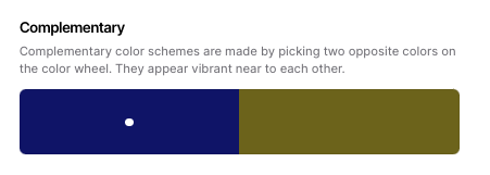
Take for example a designer who has chosen a dark Indigo as the main brand colour for a banking app. In this case I would recommend using a Gold to go with it because it's an opposite colour and the two look great together.
On the Coolors website the opposite colour doesn't look attractive:
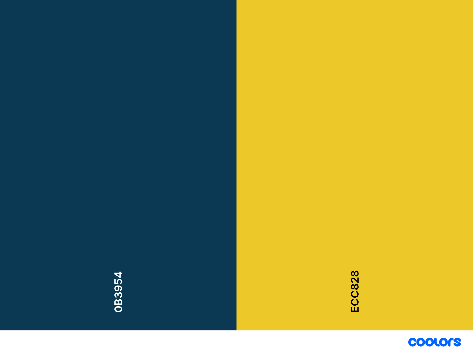
So I manually chose a better one:
I hope this article has provided you with valuable insights on how to work out what colours go together well. By understanding colour psychology, exploring different colour combinations, and applying the principles of colour theory, you can confidently create stunning and harmonious colour palettes.
Embrace the world of colour and let your creativity shine! Experiment with different hues, try out various combinations, and don't be afraid to step outside your comfort zone.
I cover much more in my Visual Design Principles course which you can find out more about here...

Earn from your design skills
Create & sell patterns for fabric, wallpaper & murals — on Spoonflower & beyond. Client-free, commute-free, creative work you can do from anywhere.
See the book →
The design job market hasn't just got harder — it's structurally broken at the entry level. Here's what the smartest 20-something designers are doing instead.

A practical guide to selling surface pattern designs on Spoonflower — what sells, how royalties work, and how to make print-ready patterns.

Seven realistic passive income streams for designers — surface pattern, templates, products, stock, courses, affiliate and merch — ranked by effort-to-income.
Learn by watching me apply key design principles
1 email per week with videos & free resources
Unsubscribe anytime.


